Summary

Campaign Setup is where advertisers build campaigns in Teads Ad Manager. The flat form stopped working as the platform added multi-format, multi-objective campaigns, so I redesigned it end to end as the sole designer and researcher, with the Ad Manager PM and three engineers.

  • Role

    Senior Product Designer, sole designer

  • Team

    1 Product Designer, 3 Engineers, 1 PM

  • Deliverables

    Research, four redesign rounds, UI design

  • Impact

    The wizard pattern became a standard for other Ad Manager workflows

01 The problem:

Beginners got stuck, power users needed control

New advertisers faced many decisions with no guidance or defaults. Experienced users needed line-level control. A redesign could easily break the workflow the power users already trusted. The setup has two levels: campaign settings, then line settings, which cover budget, product (creative type and creative assignment), targeting and bidding.

  1. No starting point. Nothing guided a new advertiser.
  2. Blank fields. Every field started empty.
  3. Lost track of what is missing. The interface is flexible and not boxed, so users explore freely, but before going live they could not remember what they had skipped.
  4. Power users at risk. A full makeover could slow them down.
  5. Settings kept piling up. The form was working, but settings were accumulating and would keep growing, so we spent development time to future-proof it. Settings are now divided by campaign type and line type (line type is a future feature).
  6. Hard to scan. The layout did not use its space to let users tell lines apart by their key information.

Interface before:
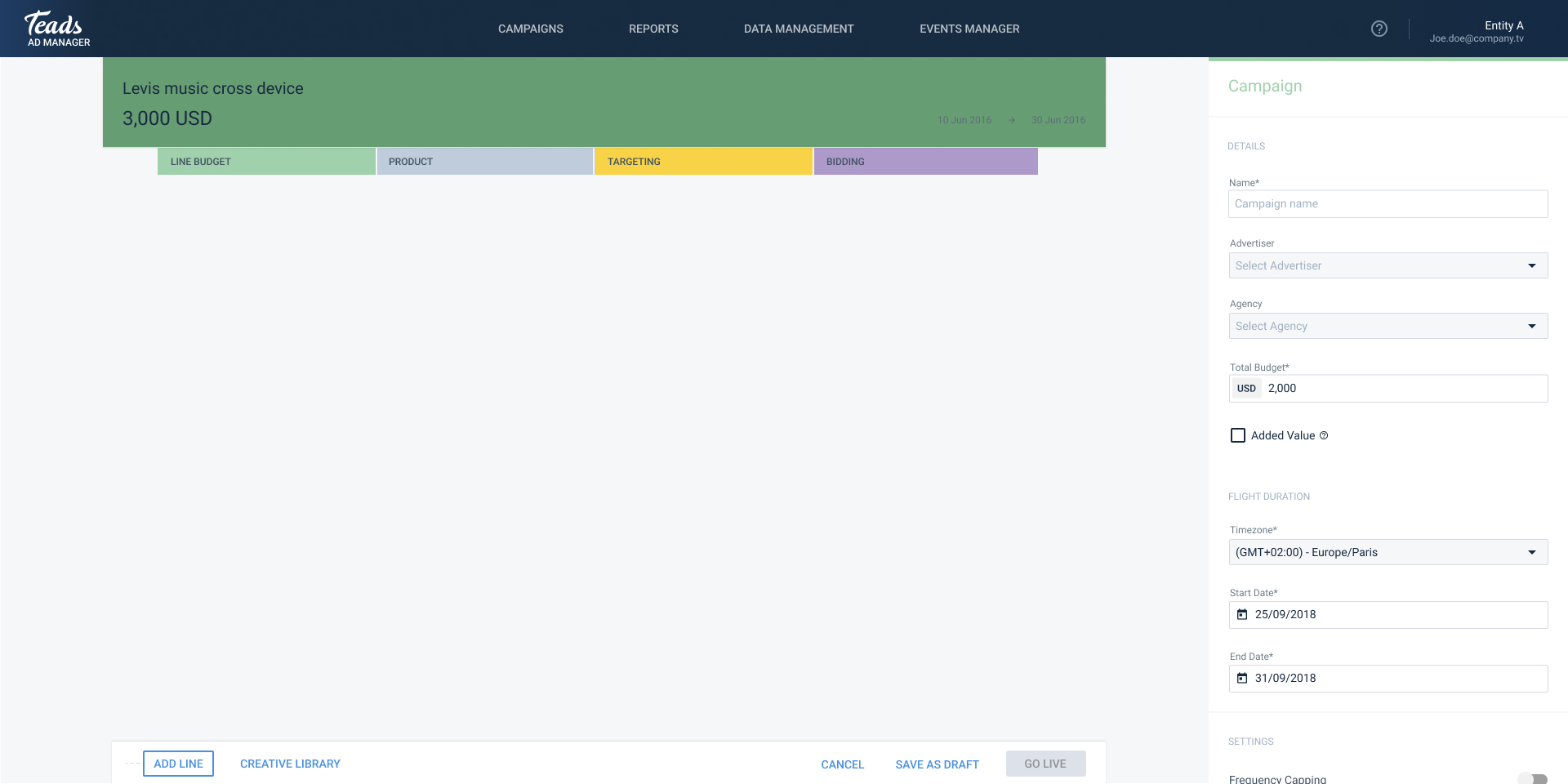
Campaign Level Settings
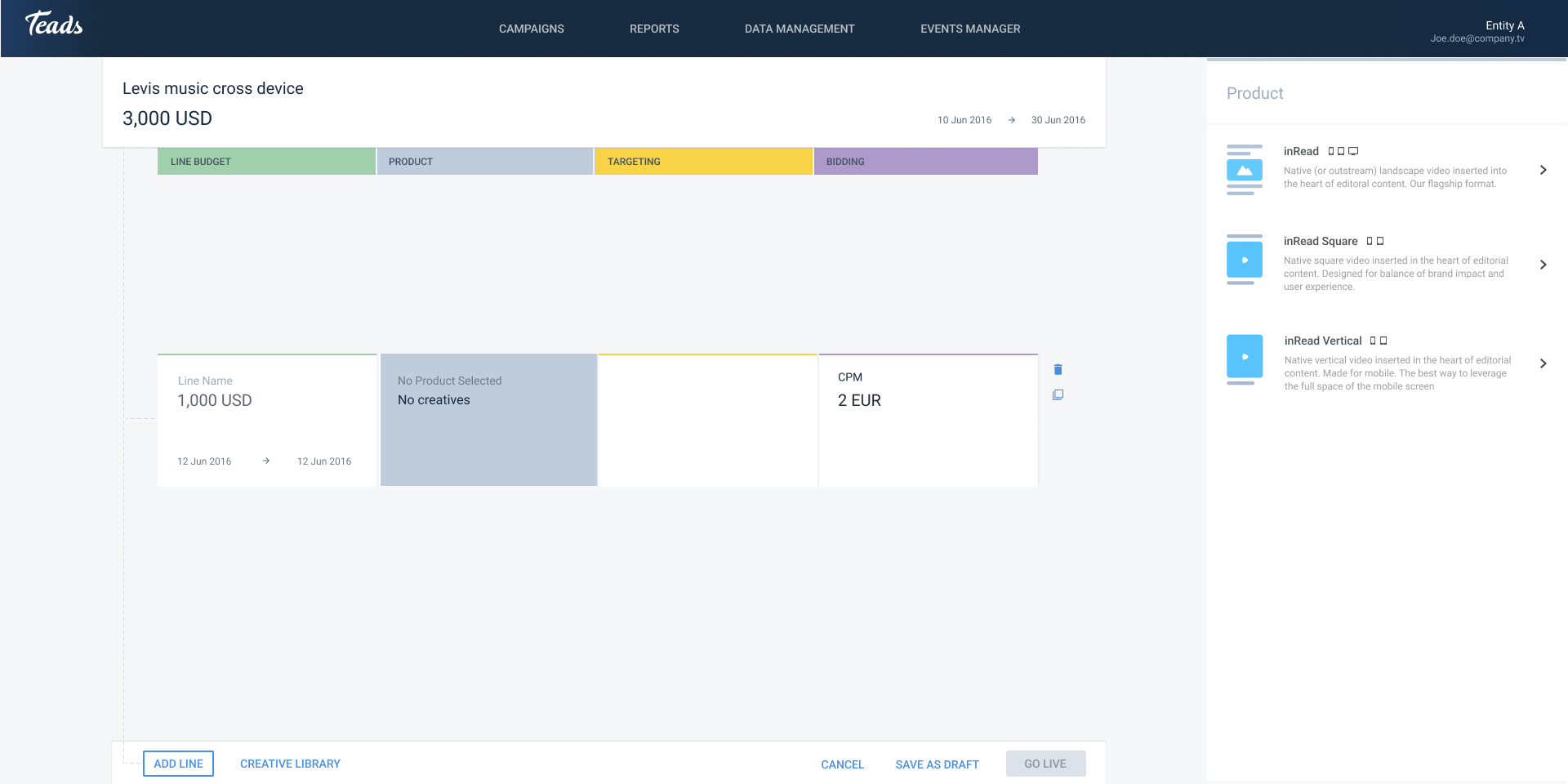
Line Level Settings - Product Section
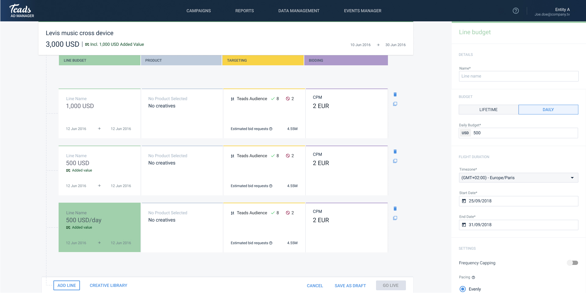
Line Level Settings - Budget section

02 What interviews showed

I interviewed account managers, traders and sales teams. Five gaps came up.

  • The table is fast.

    Users valued the line table's speed and power.

  • Lines need to be scannable.

    In the research, users named the key info they use to tell lines apart: line name, total budget, flight, creative type (carousel, single image, video and so on), how many creatives are assigned, targeting categories, bidding mode and price, and whether the bid maximizes or minimizes certain KPIs.

  • Names carry meaning.

    Agencies put their own standardized tags in campaign and line names so they can recognize campaigns across every ad buying platform. I considered generating names from the setup, but the patterns differed from agency to agency, so it was not worth it.

  • Campaigns can be huge.

    Some had 100+ line items and creatives.

  • Campaign Objective is the blocker.

    New advertisers got stuck choosing one.

  • Defaults are missing.

    Explanations and smart defaults barely existed, even though users described the same setup again and again.

    The most common presets were:

    • Lifetime budget
    • Timezone taken from the account info
    • Start date set to the day of setup
    • Even pacing
    • The advertiser the campaign is created for
    • CPM buying mode charged by impression
    • And a fixed auction type.
  • Errors get lost.

    • Inline validation existed, but nothing tracked what was incomplete.
    • If a user opened a field or section, left it empty and moved on, there was no trace of it.
    • Wrong budgets (under 1)
    • no creatives assigned after opening the product section
    • or no targeting location after opening that section went unnoticed.

03 The decision

Power users need scalability and beginners scanability

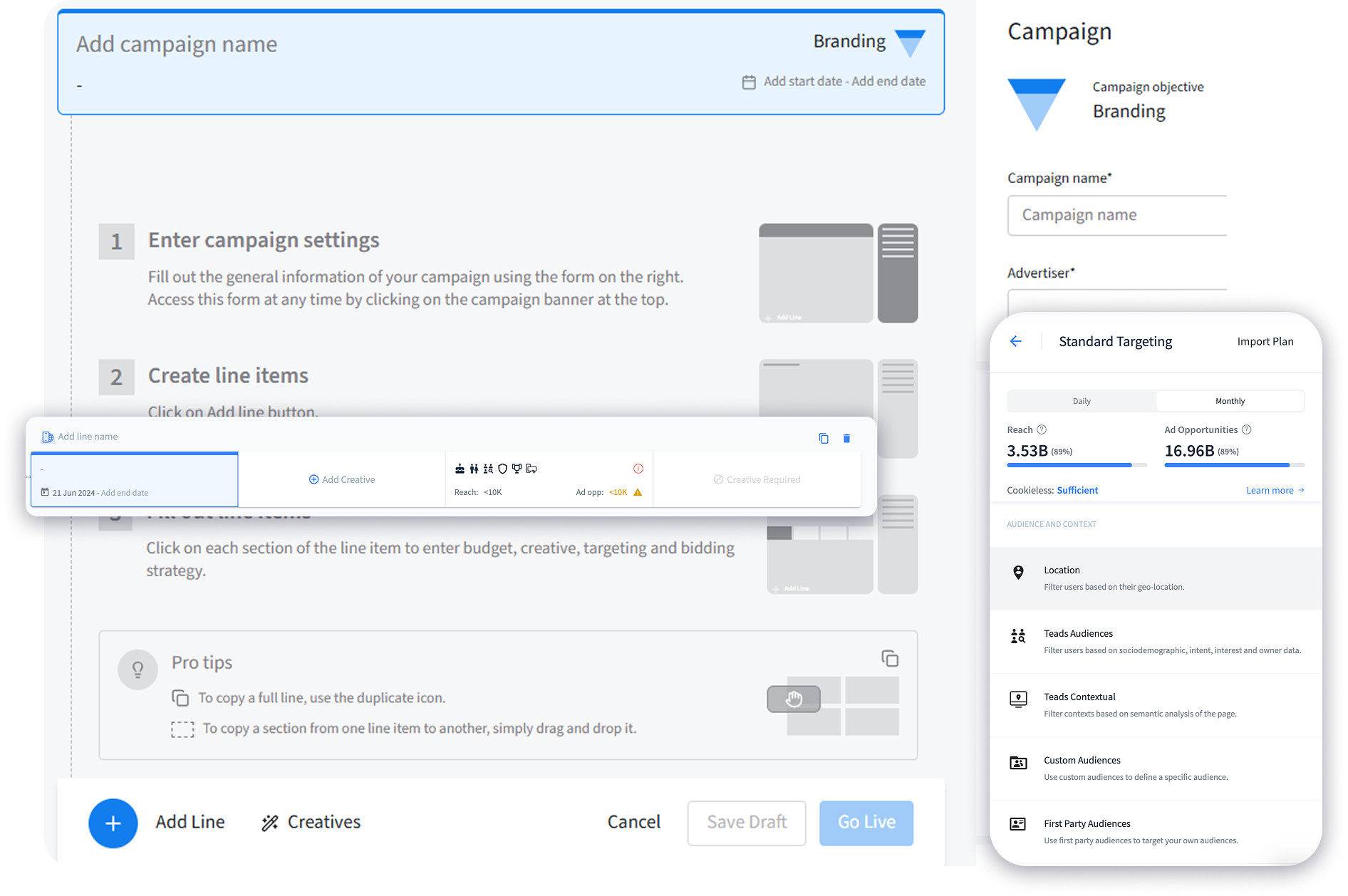
I first thought a guided, progressive form like Google, Facebook or Snapchat might work better for our users too. But users really valued and praised the current table-like structure, so I kept it and improved it a lot. It now uses the unused space and shows the meta information and actions users kept asking for. That kept the power users' tool intact. For beginners, I added a first step to choose the campaign objective, which filters the settings so they are not overwhelmed, and an empty state illustration that shows what to do next.

​

  1. Objective first, with plain-language explanations and recommended defaults.
  2. Only what is relevant. The settings available depend on the campaign objective and change with it, so the interface shows only what matters for the chosen objective.
  3. Table intact. Targeting, budget, capping, pacing and bidding stay where users expect them.
  4. Redesigned listing. I redesigned the campaign and line listing inside setup while the side form stayed the same. I added filters by status, product type, targeting type, bidding and more, plus a search bar for names.
  5. Responsive on desktop. The old structure did not hold up on smaller screens, so I made the form and the lines work across multiple desktop resolutions. Mobile was out of scope.
  6. Validation that guides. Errors help the user instead of blocking them.
  7. Built for large campaigns. For 100+ lines I also designed a version with a search bar and filters, treating the lines like a table users can filter. I designed with edge cases in mind, like very long campaign and line names and 100+ line items, and I do that in all my designs.

04 Four rounds of iteration

Guiding beginners without slowing power users

Round one: The objective selector and reorganizing the meta information.

Create Campaign Step 1 - Choose Objective

Line Level Settings - Filters, Search and Progress Bar on the Budget and Flight

Line Level Settings - Error System, Search & Filters, long Line Name edge case, Assigned Creatives meta, Progress Bar on Budget and Flight

Line Level Settings - Error System, Search & Filters, Assigned Creatives meta, Icons only for Targeting Meta

Round two: Better error handling and responsive behavior.

Errors system at the campaign level

Round three: Tighter line height and metadata, plus a new color palette, spacing and information structure for campaign and line settings.

Campaign Settings - Different Color Palette & Spacing, Different Information Structure

Line Settings - Different Color Palette & Spacing, Different Information Structure

Round four: Contextual help that works for first-timers and power users.

Empty state for new campaign creation

High fidelity prototype

05 The outcome

Power users need scalability and beginners scanability

Setup became noticeably faster for new advertisers, which supported self-serve volume. The wizard pattern was reused in other product workflows. Power users kept their familiar table, so they needed no retraining.

​

05 Looking back

Power users need scalability and beginners scanability

Sometimes what we designers think is best, or what we think looks better, is not what users want. I thought a guided, progressive form might work better, but users liked the table-like structure, so I listened and kept it. It taught me to listen to users and to run even short, fast user sessions to understand how they work.

Got a complex product that needs structure? Let's talk.

Summary

Campaign Setup is where advertisers build campaigns in Teads Ad Manager. The flat form stopped working as the platform added multi-format, multi-objective campaigns, so I redesigned it end to end as the sole designer and researcher, with the Ad Manager PM and three engineers.

  • Role

    Senior Product Designer, sole designer

  • Team

    1 Product Designer, 3 Engineers, 1 PM

  • Deliverables

    Research, four redesign rounds, UI design

  • Impact

    The wizard pattern became a standard for other Ad Manager workflows

01 The problem:

Beginners got stuck, power users needed control

New advertisers faced many decisions with no guidance or defaults. Experienced users needed line-level control. A redesign could easily break the workflow the power users already trusted. The setup has two levels: campaign settings, then line settings, which cover budget, product (creative type and creative assignment), targeting and bidding.

  1. No starting point. Nothing guided a new advertiser.
  2. Blank fields. Every field started empty.
  3. Lost track of what is missing. The interface is flexible and not boxed, so users explore freely, but before going live they could not remember what they had skipped.
  4. Power users at risk. A full makeover could slow them down.
  5. Settings kept piling up. The form was working, but settings were accumulating and would keep growing, so we spent development time to future-proof it. Settings are now divided by campaign type and line type (line type is a future feature).
  6. Hard to scan. The layout did not use its space to let users tell lines apart by their key information.

Interface before:

Campaign Level Settings

Line Level Settings - Product Section

Line Level Settings - Budget section

02 What interviews showed

I interviewed account managers, traders and sales teams. Five gaps came up.

  • The table is fast.

    Users valued the line table's speed and power.

  • Campaign Objective is the blocker.

    New advertisers got stuck choosing one.

  • Defaults are missing.

    Explanations and smart defaults barely existed, even though users described the same setup again and again.

    The most common presets were:

    • Lifetime budget
    • Timezone taken from the account info
    • Start date set to the day of setup
    • Even pacing
    • The advertiser the campaign is created for
    • CPM buying mode charged by impression
    • And a fixed auction type.
  • Errors get lost.

    • Inline validation existed, but nothing tracked what was incomplete.
    • If a user opened a field or section, left it empty and moved on, there was no trace of it.
    • Wrong budgets (under 1)
    • no creatives assigned after opening the product section
    • or no targeting location after opening that section went unnoticed.
  • Lines need to be scannable.

    In the research, users named the key info they use to tell lines apart: line name, total budget, flight, creative type (carousel, single image, video and so on), how many creatives are assigned, targeting categories, bidding mode and price, and whether the bid maximizes or minimizes certain KPIs.

  • Names carry meaning.

    Agencies put their own standardized tags in campaign and line names so they can recognize campaigns across every ad buying platform. I considered generating names from the setup, but the patterns differed from agency to agency, so it was not worth it.

  • Campaigns can be huge.

    Some had 100+ line items and creatives.

03 The decision

Power users need scalability and beginners scanability

I first thought a guided, progressive form like Google, Facebook or Snapchat might work better for our users too. But users really valued and praised the current table-like structure, so I kept it and improved it a lot. It now uses the unused space and shows the meta information and actions users kept asking for. That kept the power users' tool intact. For beginners, I added a first step to choose the campaign objective, which filters the settings so they are not overwhelmed, and an empty state illustration that shows what to do next.

​

  1. Objective first, with plain-language explanations and recommended defaults.
  2. Only what is relevant. The settings available depend on the campaign objective and change with it, so the interface shows only what matters for the chosen objective.
  3. Table intact. Targeting, budget, capping, pacing and bidding stay where users expect them.
  4. Redesigned listing. I redesigned the campaign and line listing inside setup while the side form stayed the same. I added filters by status, product type, targeting type, bidding and more, plus a search bar for names.
  5. Responsive on desktop. The old structure did not hold up on smaller screens, so I made the form and the lines work across multiple desktop resolutions. Mobile was out of scope.
  6. Validation that guides. Errors help the user instead of blocking them.
  7. Built for large campaigns. For 100+ lines I also designed a version with a search bar and filters, treating the lines like a table users can filter. I designed with edge cases in mind, like very long campaign and line names and 100+ line items, and I do that in all my designs.

04 Four rounds of iteration

Guiding beginners without slowing power users

Round one: The objective selector and reorganizing the meta information.

Create Campaign Step 1 - Choose Objective

Line Level Settings - Filters, Search and Progress Bar on the Budget and Flight

Line Level Settings - Error System, Search & Filters, long Line Name edge case, Assigned Creatives meta, Progress Bar on Budget and Flight

Line Level Settings - Error System, Search & Filters, Assigned Creatives meta, Icons only for Targeting Meta

Round two: Better error handling and responsive behavior.

Errors system at the campaign level

Round three: Tighter line height and metadata, plus a new color palette, spacing and information structure for campaign and line settings.

Campaign Settings - Different Color Palette & Spacing, Different Information Structure

Line Settings - Different Color Palette & Spacing, Different Information Structure

Round four: Contextual help that works for first-timers and power users.

Empty state for new campaign creation

High fidelity prototype

05 The outcome

Power users need scalability and beginners scanability

Setup became noticeably faster for new advertisers, which supported self-serve volume. The wizard pattern was reused in other product workflows. Power users kept their familiar table, so they needed no retraining.

05 Looking back

Power users need scalability and beginners scanability

Sometimes what we designers think is best, or what we think looks better, is not what users want. I thought a guided, progressive form might work better, but users liked the table-like structure, so I listened and kept it. It taught me to listen to users and to run even short, fast user sessions to understand how they work.

Got a complex product that needs structure? Let's talk.

Summary

Campaign Setup is where advertisers build campaigns in Teads Ad Manager. The flat form stopped working as the platform added multi-format, multi-objective campaigns, so I redesigned it end to end as the sole designer and researcher, with the Ad Manager PM and three engineers.

  • Role

    Senior Product Designer, sole designer

  • Team

    1 Product Designer, 3 Engineers, 1 PM

  • Deliverables

    Research, four redesign rounds, UI design

  • Impact

    The wizard pattern became a standard for other Ad Manager workflows

01 The problem:

Beginners got stuck, power users needed control

New advertisers faced many decisions with no guidance or defaults. Experienced users needed line-level control. A redesign could easily break the workflow the power users already trusted. The setup has two levels: campaign settings, then line settings, which cover budget, product (creative type and creative assignment), targeting and bidding.

  1. No starting point. Nothing guided a new advertiser.
  2. Blank fields. Every field started empty.
  3. Lost track of what is missing. The interface is flexible and not boxed, so users explore freely, but before going live they could not remember what they had skipped.
  4. Power users at risk. A full makeover could slow them down.
  5. Settings kept piling up. The form was working, but settings were accumulating and would keep growing, so we spent development time to future-proof it. Settings are now divided by campaign type and line type (line type is a future feature).
  6. Hard to scan. The layout did not use its space to let users tell lines apart by their key information.

Interface before:

Campaign Level Settings

Line Level Settings - Product Section

Line Level Settings - Budget section

02 What interviews showed

I interviewed account managers, traders and sales teams. Five gaps came up.

  • FINDING 1

    The table is fast.

    Users valued the line table's speed and power.

  • FINDING 2

    Campaign Objective is the blocker.

    New advertisers got stuck choosing one.

  • FINDING 3

    Defaults are missing.

    Explanations and smart defaults barely existed, even though users described the same setup again and again.

    The most common presets were:

    • Lifetime budget
    • Timezone taken from the account info
    • Start date set to the day of setup
    • Even pacing
    • The advertiser the campaign is created for
    • CPM buying mode charged by impression
    • And a fixed auction type.
  • FINDING 4

    Errors get lost.

    Inline validation existed, but nothing tracked what was incomplete.

    If a user opened a field or section, left it empty and moved on, there was no trace of it.

    • Wrong budgets (under 1)
    • no creatives assigned after opening the product section
    • or no targeting location after opening that section went unnoticed.
  • FINDING 5

    Lines need to be scannable.

    In the research, users named the key info they use to tell lines apart: line name, total budget, flight, creative type (carousel, single image, video and so on), how many creatives are assigned, targeting categories, bidding mode and price, and whether the bid maximizes or minimizes certain KPIs.

  • FINDING 6

    Names carry meaning.

    Agencies put their own standardized tags in campaign and line names so they can recognize campaigns across every ad buying platform. I considered generating names from the setup, but the patterns differed from agency to agency, so it was not worth it.

  • FINDING 7

    Campaigns can be huge.

    Some had 100+ line items and creatives.

03 The decision

Keep the table, add an objective step

I first thought a guided, progressive form like Google, Facebook or Snapchat might work better for our users too. But users really valued and praised the current table-like structure, so I kept it and improved it a lot. It now uses the unused space and shows the meta information and actions users kept asking for. That kept the power users' tool intact. For beginners, I added a first step to choose the campaign objective, which filters the settings so they are not overwhelmed, and an empty state illustration that shows what to do next.

​

  1. Objective first, with plain-language explanations and recommended defaults.
  2. Only what is relevant. The settings available depend on the campaign objective and change with it, so the interface shows only what matters for the chosen objective.
  3. Table intact. Targeting, budget, capping, pacing and bidding stay where users expect them.
  4. Redesigned listing. I redesigned the campaign and line listing inside setup while the side form stayed the same. I added filters by status, product type, targeting type, bidding and more, plus a search bar for names.
  5. Responsive on desktop. The old structure did not hold up on smaller screens, so I made the form and the lines work across multiple desktop resolutions. Mobile was out of scope.
  6. Validation that guides. Errors help the user instead of blocking them.
  7. Built for large campaigns. For 100+ lines I also designed a version with a search bar and filters, treating the lines like a table users can filter. I designed with edge cases in mind, like very long campaign and line names and 100+ line items, and I do that in all my designs.

04 Four rounds of iteration

Guiding beginners without slowing power users

Round one: The objective selector and reorganizing the meta information.

Create Campaign Step 1 - Choose Objective

Line Level Settings - Filters, Search and Progress Bar on the Budget and Flight

Line Level Settings - Error System, Search & Filters, long Line Name edge case, Assigned Creatives meta, Progress Bar on Budget and Flight

Line Level Settings - Error System, Search & Filters, Assigned Creatives meta, Icons only for Targeting Meta

Round two: Better error handling and responsive behavior.

Errors system at the campaign level

Round three: Tighter line height and metadata, plus a new color palette, spacing and information structure for campaign and line settings.

Campaign Settings - Different Color Palette & Spacing, Different Information Structure

Line Settings - Different Color Palette & Spacing, Different Information Structure

Round four: Contextual help that works for first-timers and power users.

Empty state for new campaign creation

High fidelity prototype

05 The outcome

A structure to grow the business with new features and settings for different clients

Setup became noticeably faster for new advertisers, which supported self-serve volume. The wizard pattern was reused in other product workflows. Power users kept their familiar table, so they needed no retraining.

​

05 Looking back

Don't assume, ask users

Sometimes what we designers think is best, or what we think looks better, is not what users want. I thought a guided, progressive form might work better, but users liked the table-like structure, so I listened and kept it. It taught me to listen to users and to run even short, fast user sessions to understand how they work.

Got a complex product that needs structure? Let's talk.